Matplotlib
Matplotlib is used for creating static, interactive, and animated visualizations. It provides a wide range of plotting functions, allowing us to generate line plots, bar charts, histograms, scatter plots, and more.
Write the import matplotlib.pyplot as plt and/or import numpy as np statements at the beginning of every example.
Table of contents
- Introduction
- Custom styles
- Line plots
- Bar charts
- Histograms
- Pie charts
- Box charts
- Scatter plots
- Subplots
- 3D plots
Introduction
How to create a chart?
- Create the figure
- Plot the data (multiple times, if needed)
- Configure the axes
- Add annotations
- Show/save the figure
plt.figure() # creating the graph figure

# Setting the coordinates of the points to plot, their values, and labels for the legend
plt.plot([1, 2], [3, 4], label="Python")
plt.plot([1, 3], [1, 2], label="Java")

# Setting the limits (boundaries) of both axes
plt.xlim(0, 4)
plt.ylim(0, 5)

# Positions on the X axis where ticks should appear along with their optional labels
plt.xticks([0, 1, 2, 3, 4], ["zero", "one", "two", "three", "four"])
plt.yticks([0, 1, 2, 3, 4, 5])

# Labeling the axes
plt.xlabel("X")
plt.ylabel("Y")

plt.legend(loc="upper center", ncol=3) # setting the placement of the legend
plt.grid(True) # enabling the default major-grid lines

plt.show() # displaying the graph
# plt.savefig("graph.png") - saving the graph as an image
Custom styles
We can use default and custom styles by just enclosing the whole code from the example above in a with clause like this: with plt.style.context("ggplot"):. While ggplot is a built-in style, you can also define your own styles using, e.g., with plt.style.context("custom_style.mplstyle"):.
# the custom_style.mplstyle file

# Colors
axes.prop_cycle: cycler("color", ["#1b9e77", "#d95f02", "#7570b3", "#e7298a"])

# Figure
figure.figsize: 7, 4
figure.dpi: 120

# Axes
axes.titlesize: 14
axes.labelsize: 12
axes.grid: True
axes.spines.top: False
axes.spines.right: False

# Grid
grid.color: gray
grid.linestyle: -
grid.linewidth: 0.8
grid.alpha: 0.6

# Ticks
xtick.labelsize: 10
ytick.labelsize: 10

# Legend
legend.frameon: False
legend.fontsize: 10

# Lines
lines.linewidth: 2
lines.markersize: 6
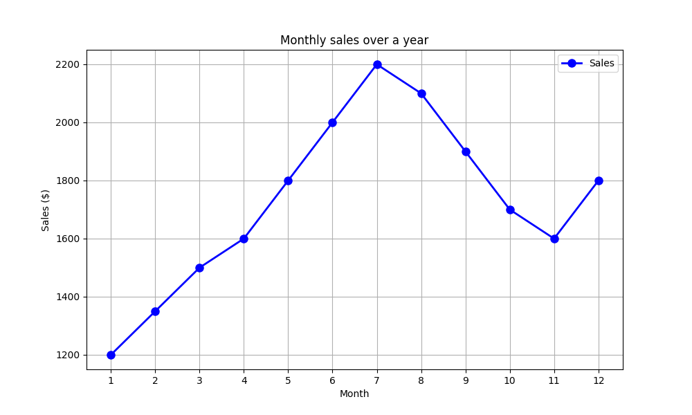
Line plots
Line plots are used to visualize trends and continuous data over time or ordered sequences.
months = np.arange(1, 13)
sales = np.array([1200, 1350, 1500, 1600, 1800, 2000, 2200, 2100, 1900, 1700, 1600, 1800])

plt.figure(figsize=(10, 6))
plt.plot(months, sales, marker="o", color="blue", linestyle="-", linewidth=2, markersize=8, label="Sales") # marker is a symbol used to mark each data point on the line
plt.title("Monthly sales over a year")
plt.xlabel("Month")
plt.ylabel("Sales ($)")
plt.xticks(months) # show all months on the X axis
plt.grid(True)
plt.legend()
plt.show()
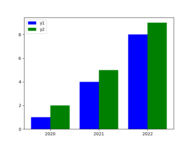
Bar charts
Bar charts are used to compare categorical data by showing values as rectangular bars.
years = np.arange(2020, 2023)
values1 = [1, 4, 8]
values2 = [2, 5, 9]

plt.figure()
# bar() - vertical bars, barh() - horizontal bars

plt.bar(years - 0.2, values1, color="blue", edgecolor="none", width=0.4, align="center", label="y1")
plt.bar(years + 0.2, values2, color="green", edgecolor="none", width=0.4, align="center", label="y2")
plt.xticks(years, [str(years) for years in years])

plt.legend()
plt.show()
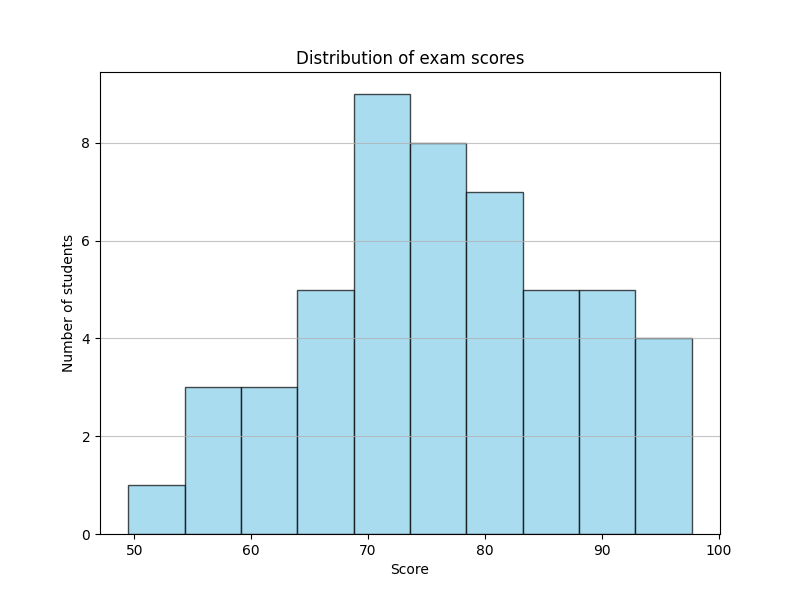
Histograms
Histograms are used to display the distribution of numeric data by grouping values into bins.
np.random.seed(0)
scores = np.random.normal(loc=75, scale=10, size=50) # mean = 75, std = 10

plt.figure(figsize=(8, 6))
plt.hist(scores, bins=10, color="skyblue", edgecolor="black", alpha=0.7) # bins is a number of intervals (bars) used to group the data
plt.title("Distribution of exam scores")
plt.xlabel("Score")
plt.ylabel("Number of students")
plt.grid(axis="y", alpha=0.75)
plt.show()
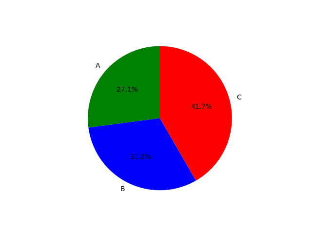
Pie charts
Pie charts are used to show proportions or percentages of a whole dataset.
counts = [13, 15, 20]
plt.figure()
plt.pie(counts, colors=["green", "blue", "red"], labels=["A", "B", "C"],
        startangle=90, # the rotation angle (in degrees) where the pie chart starts
        autopct="%1.1f%%") # the format for displaying percentage values on slices
plt.show()
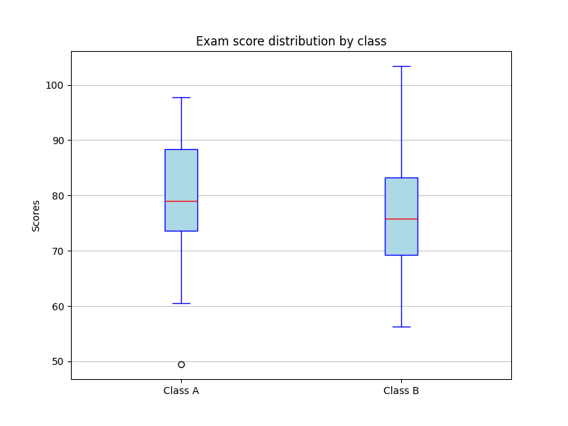
Box charts
Box charts are used to summarize data distributions, highlighting medians, quartiles, and outliers.
np.random.seed(0) # setting a random seed to ensure reproducible results
class_a = np.random.normal(
    75, # mean (average exam score for class A)
    10, # standard deviation (how spread out the scores are)
    30 # number of students (data points to generate)
)
class_b = np.random.normal(80, 12, 30)
plt.figure(figsize=(8, 6)) # figsize is setting the width and height of the figure in inches

plt.boxplot(
    [class_a, class_b], # data to be plotted as separate boxplots
    tick_labels=["Class A", "Class B"], # labels shown on the x-axis
    patch_artist=True, # allowing box colors to be filled
    boxprops=dict(
        facecolor="lightblue", # fill color of the boxes
        color="blue" # color of the box borders
    ),
    medianprops=dict(
        color="red" # color of the median line
    ),
    whiskerprops=dict(
        color="blue" # color of the whiskers
    ),
    capprops=dict(
        color="blue" # color of the whisker caps
    )
)

plt.title("Exam score distribution by class")
plt.ylabel("Scores")

plt.grid(
    axis="y", # enabling grid lines only along the y-axis
    alpha=0.75 # setting grid line transparency
)

plt.show()
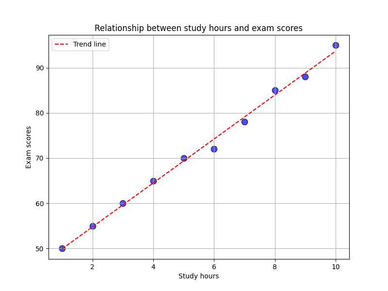
Scatter plots
Scatter plots are used to examine relationships or correlations between two numeric variables.
study_hours = np.array([1, 2, 3, 4, 5, 6, 7, 8, 9, 10])
exam_scores = np.array([50, 55, 60, 65, 70, 72, 78, 85, 88, 95])

plt.figure(figsize=(8, 6))
plt.scatter(study_hours, exam_scores, color="blue", s=80, alpha=0.7, edgecolors="black") # s is the size of points
plt.title("Relationship between study hours and exam scores")
plt.xlabel("Study hours")
plt.ylabel("Exam scores")
plt.grid(True)

z = np.polyfit(study_hours, exam_scores, 1) # degree 1 = linear fit
p = np.poly1d(z) # creating a polynomial function from fit
plt.plot(study_hours, p(study_hours), "r--", label="Trend line") # "r--" means a red dashed line
plt.legend()

plt.show()
Subplots
Subplots are used to display multiple plots in a single figure for comparison or combined visualization.
x = np.linspace(0.1, 10, 100) # creating 100 evenly spaced values between 0.1 and 10 (from 0.1 to avoid division by zero for cot)

plt.figure()

def draw_function(subplot_data, x, y, color, label, title):
    plt.subplot(*subplot_data) # subplot(nrows, ncols, index): 2 rows, 2 columns, first subplot position
    plt.plot(x, y, color, label=label)
    plt.title(title)
    if title == "Tangent" or title == "Cotangent":
        plt.ylim(-10, 10) # limit the Y axis for better visibility
    plt.legend()
    plt.grid(True)

draw_function([2, 2, 1], x, np.sin(x), "blue", "sin(x)", "Sine")
draw_function([2, 2, 2], x, np.cos(x), "red", "cos(x)", "Cosine")
draw_function([2, 2, 3], x, np.tan(x), "green", "tan(x)", "Tangent")
draw_function([2, 2, 4], x, 1 / np.tan(x), "purple", "cot(x)", "Cotangent")

plt.tight_layout() # automatically adjusting spacing to prevent overlapping elements
plt.show()

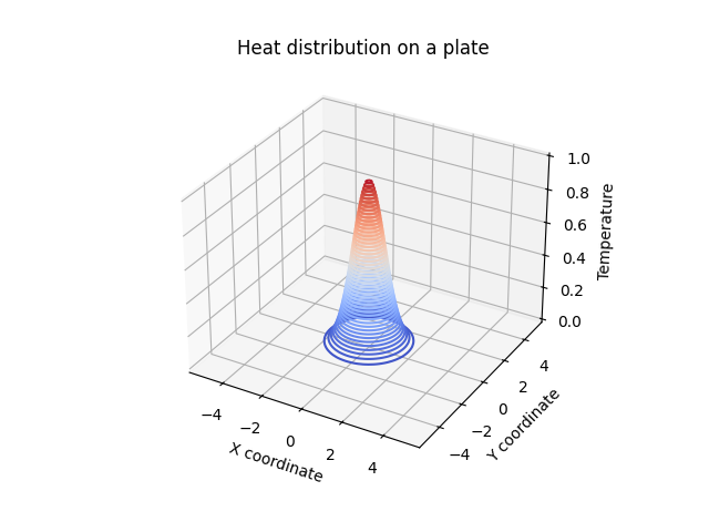
3D plots
3D plots are used to visualize data with three dimensions to show spatial relationships or surface structures.
3D contour plots
# Simulating temperature on a plate
x = np.linspace(-5, 5, 100)
y = np.linspace(-5, 5, 100)
x, y = np.meshgrid(x, y)
z = np.exp(-(x ** 2 + y ** 2)) # temperature distribution

fig = plt.figure()
ax = fig.add_subplot(111, projection="3d")
ax.contour3D(x, y, z, 50, cmap="coolwarm")

ax.set_xlabel("X coordinate")
ax.set_ylabel("Y coordinate")
ax.set_zlabel("Temperature")
ax.set_title("Heat distribution on a plate")

plt.show()
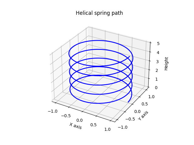
3D line plots (a helical spring)
# A parametric equation of a helix
t = np.linspace(0, 10 * np.pi, 500)
x = np.cos(t)
y = np.sin(t)
z = t / (2 * np.pi) # vertical axis

fig = plt.figure()
ax = fig.add_subplot(111, projection="3d")
ax.plot(x, y, z, color="blue", linewidth=2)

ax.set_xlabel("X axis")
ax.set_ylabel("Y axis")
ax.set_zlabel("Height")
ax.set_title("Helical spring path")
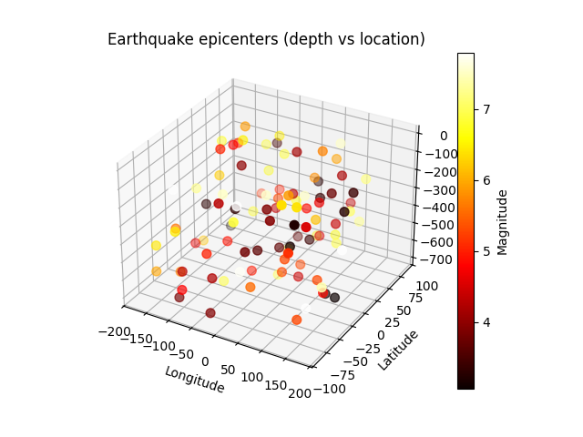
3D scatter plots
# Simulating earthquake data (latitude, longitude, depth)
np.random.seed(0)
latitude = np.random.uniform(-90, 90, 100)
longitude = np.random.uniform(-180, 180, 100)
depth = np.random.uniform(0, 700, 100) # depth in km
magnitude = np.random.uniform(3, 8, 100) # magnitude for color

fig = plt.figure()
ax = fig.add_subplot(111, projection="3d")
scatter = ax.scatter(longitude, latitude, -depth, c=magnitude, cmap="hot", s=50)

ax.set_xlabel("Longitude")
ax.set_ylabel("Latitude")
ax.set_zlabel("Depth (km)")
ax.set_title("Earthquake epicenters (depth vs location)")

fig.colorbar(scatter, ax=ax, label="Magnitude")
plt.show()
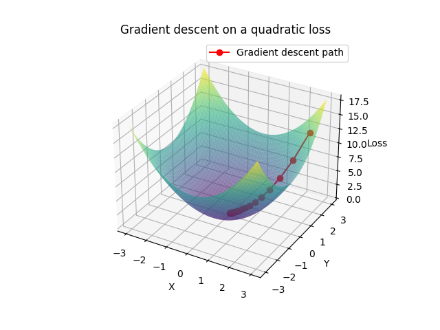
3D surface plots (a gradient descent visualization)
# Simulating a 3D quadratic loss function
x = np.linspace(-3, 3, 100)
y = np.linspace(-3, 3, 100)
x, y = np.meshgrid(x, y)
z = x ** 2 + y ** 2 # a simple convex loss function

# Gradient descent parameters
lr = 0.1
num_steps = 20
point = np.array([2.5, 2.5]) # the starting point
path = [point.copy()]

for _ in range(num_steps):
    grad = 2 * point
    point -= lr * grad
    path.append(point.copy())

path = np.array(path)
z_path = np.sum(path ** 2, axis=1)

fig = plt.figure()
ax = fig.add_subplot(111, projection="3d")
ax.plot_surface(x, y, z, cmap="viridis", alpha = 0.6)
ax.plot(path[:, 0], path[:, 1], z_path, color="red", marker="o", label="Gradient descent path")

ax.set_xlabel("X")
ax.set_ylabel("Y")
ax.set_zlabel("Loss")
ax.set_title("Gradient descent on a quadratic loss")
ax.legend()
plt.show()